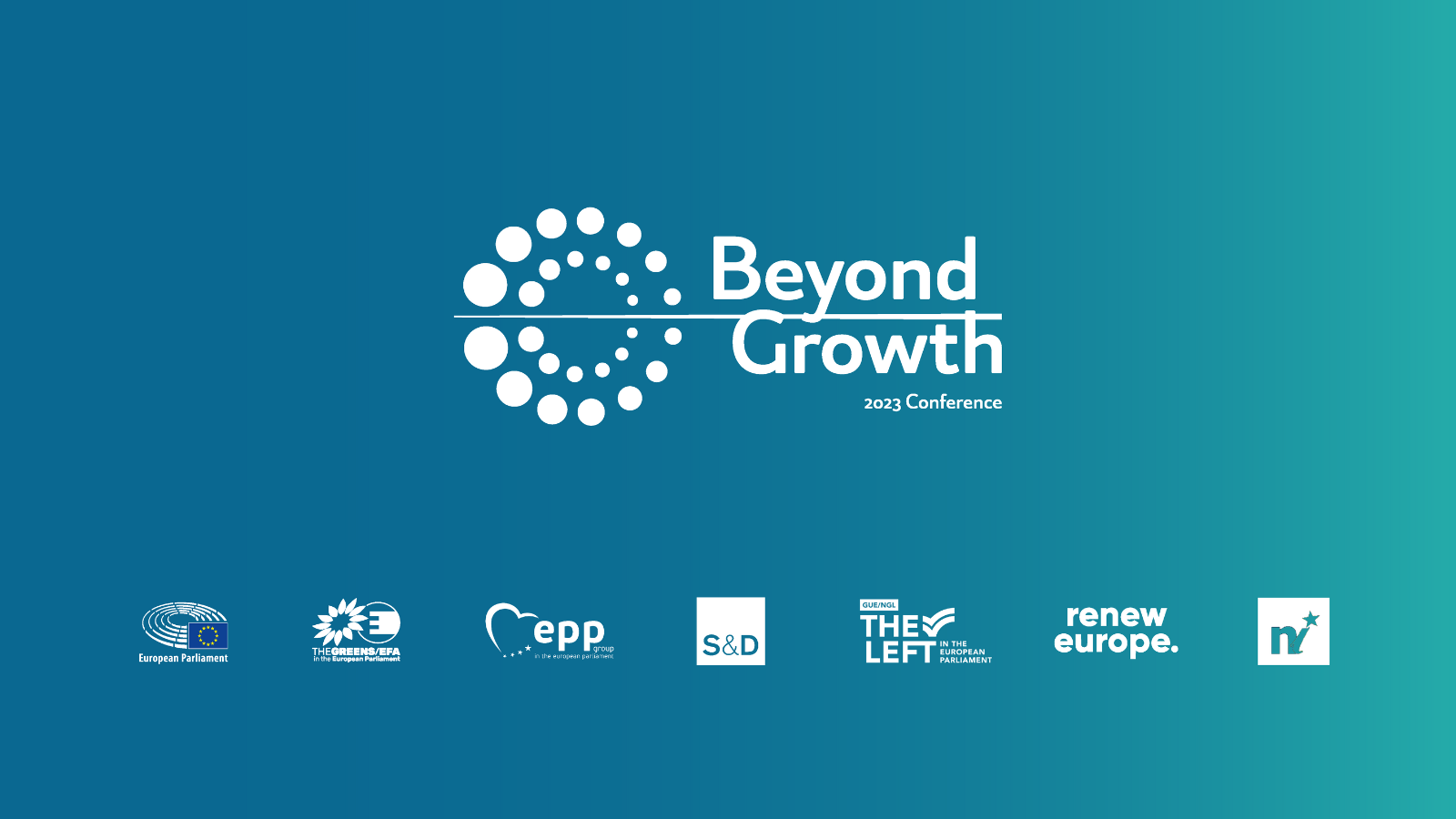
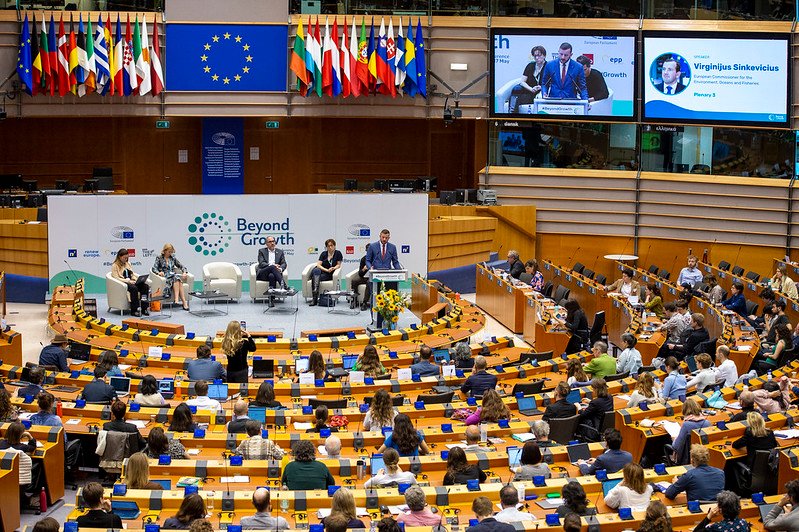
What’s the point of GDP growth if it’s wrecking our planet and communities? This question fueled the Beyond Growth 2023 Conference, a landmark event organised by 20 MEPs from five political groups in the European Parliament. It wasn’t just another conference—it was the first domino in a chain reaction.
Our challenge? Designing for an audience as diverse as Europe itself: activists, economists, scientists, politicians, journalists, artists and concerned citizens. Each group needed to feel seen, heard, and inspired. No pressure, right? Luckily, we’re called Okay When for a reason!
The magic formula
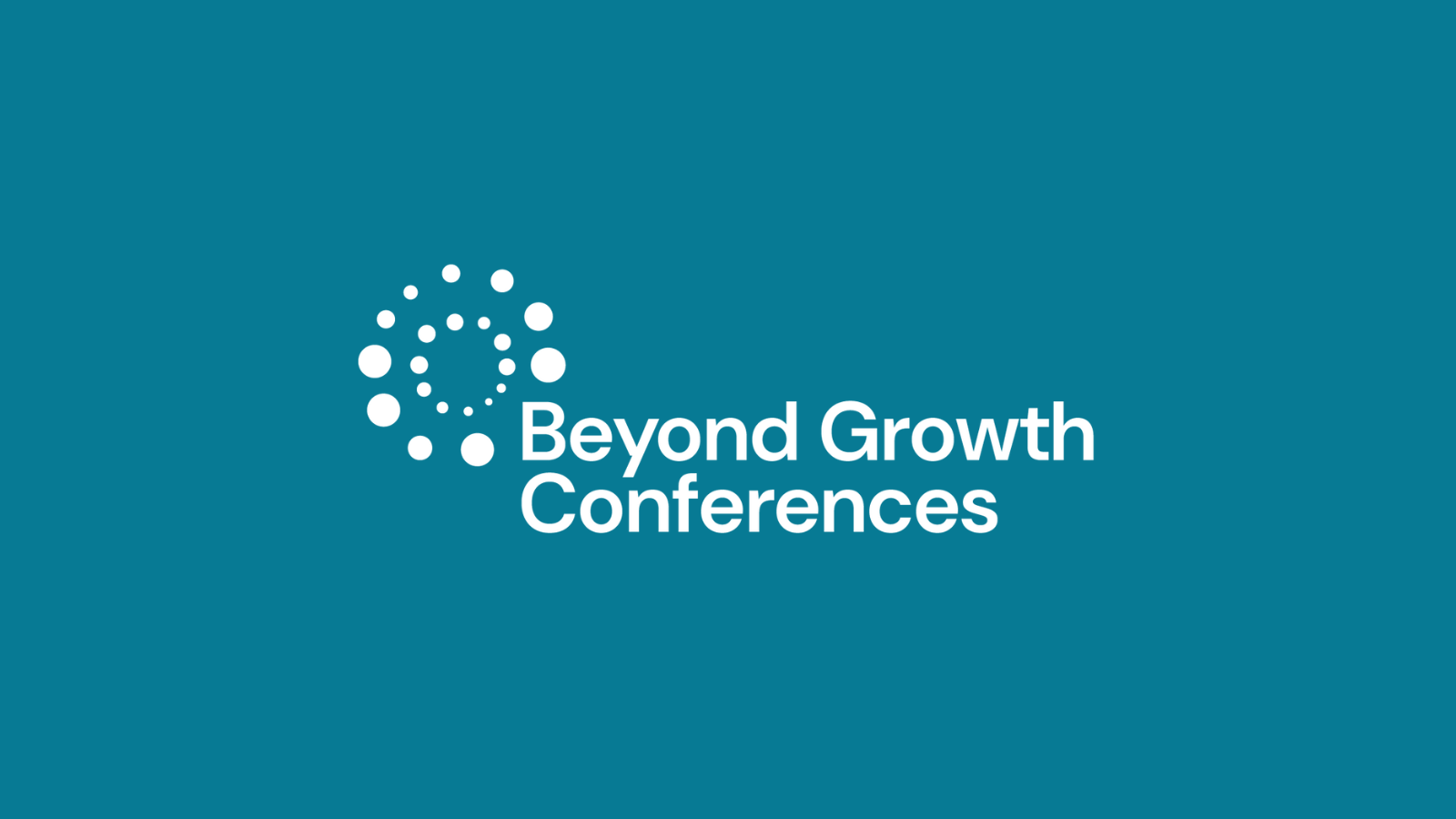
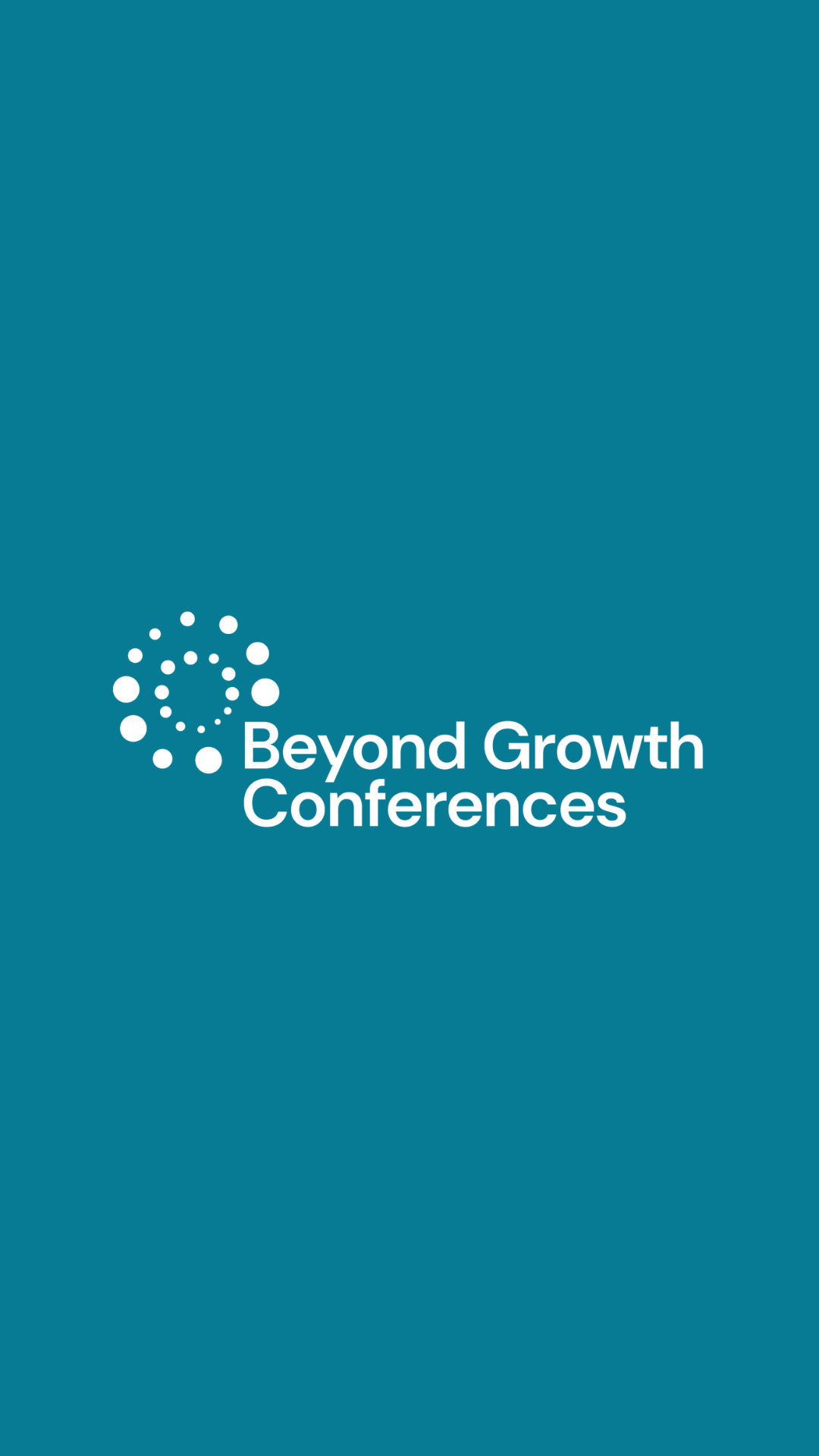
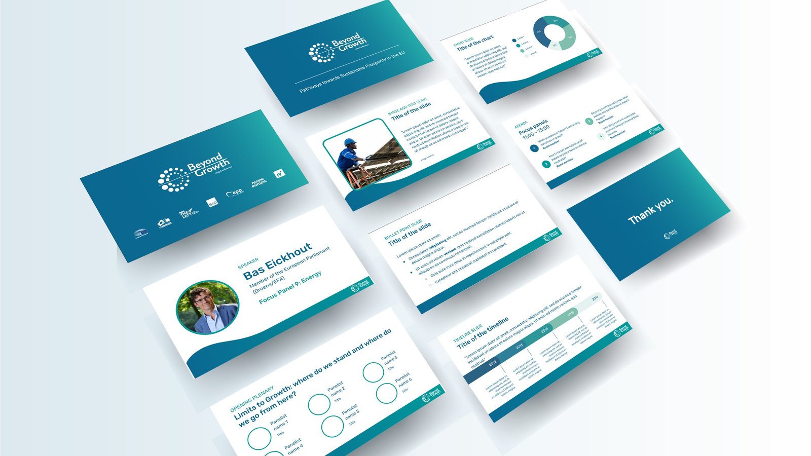
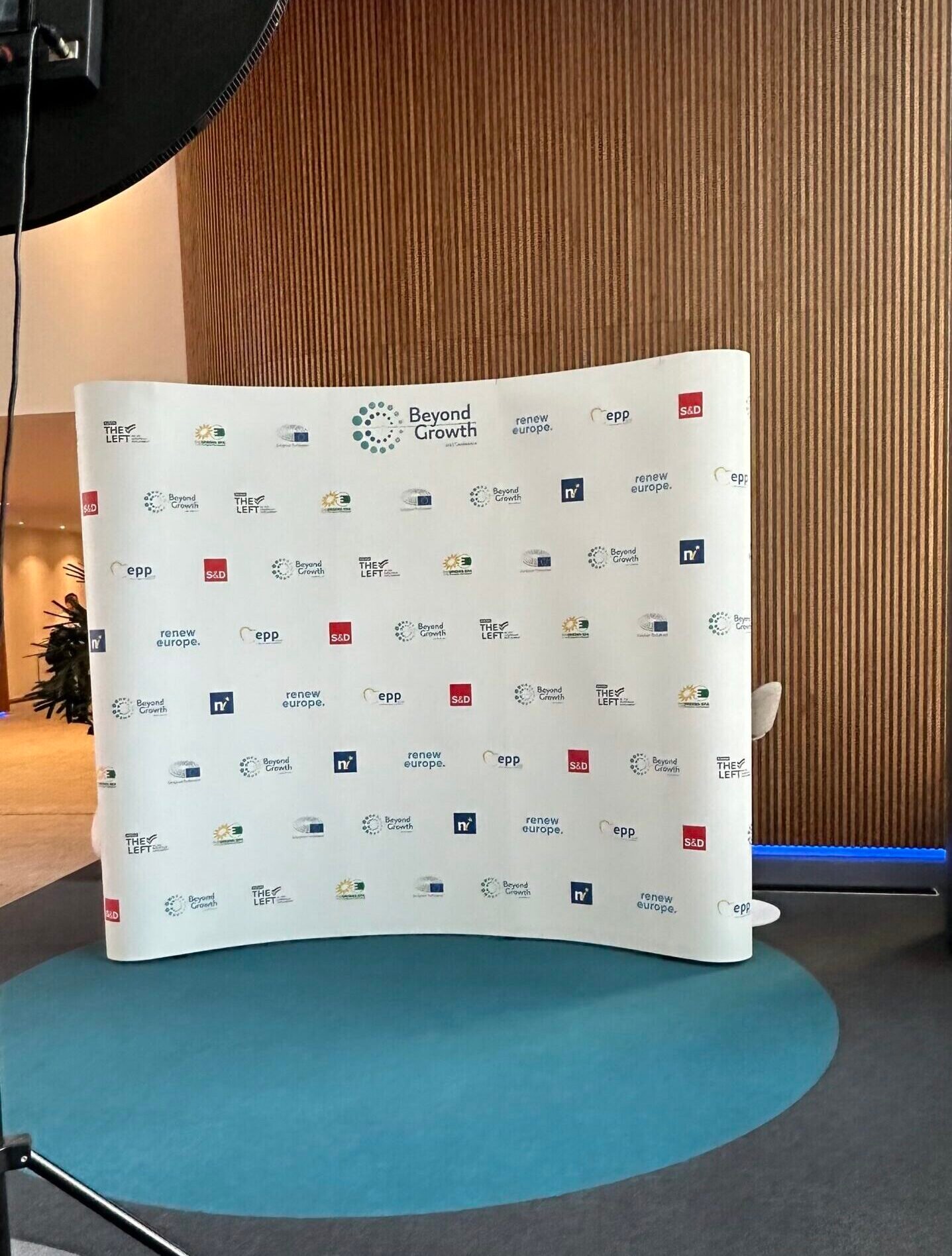
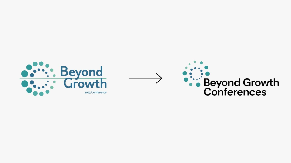
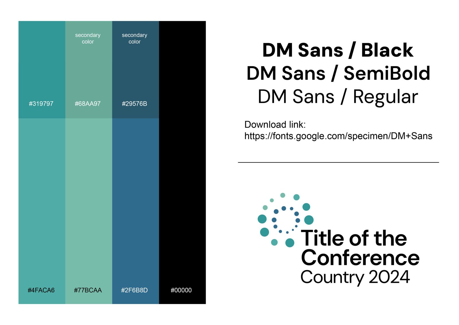
We started with a visual identity that mirrored the movement’s core: multiplicity in unity. Simple, bold and adaptable – just like the solutions the conference championed.
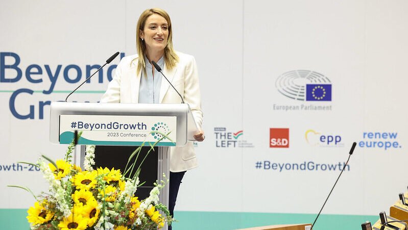
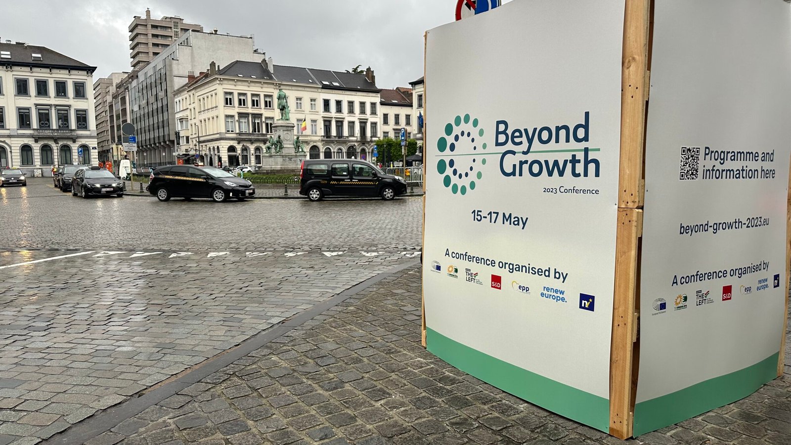
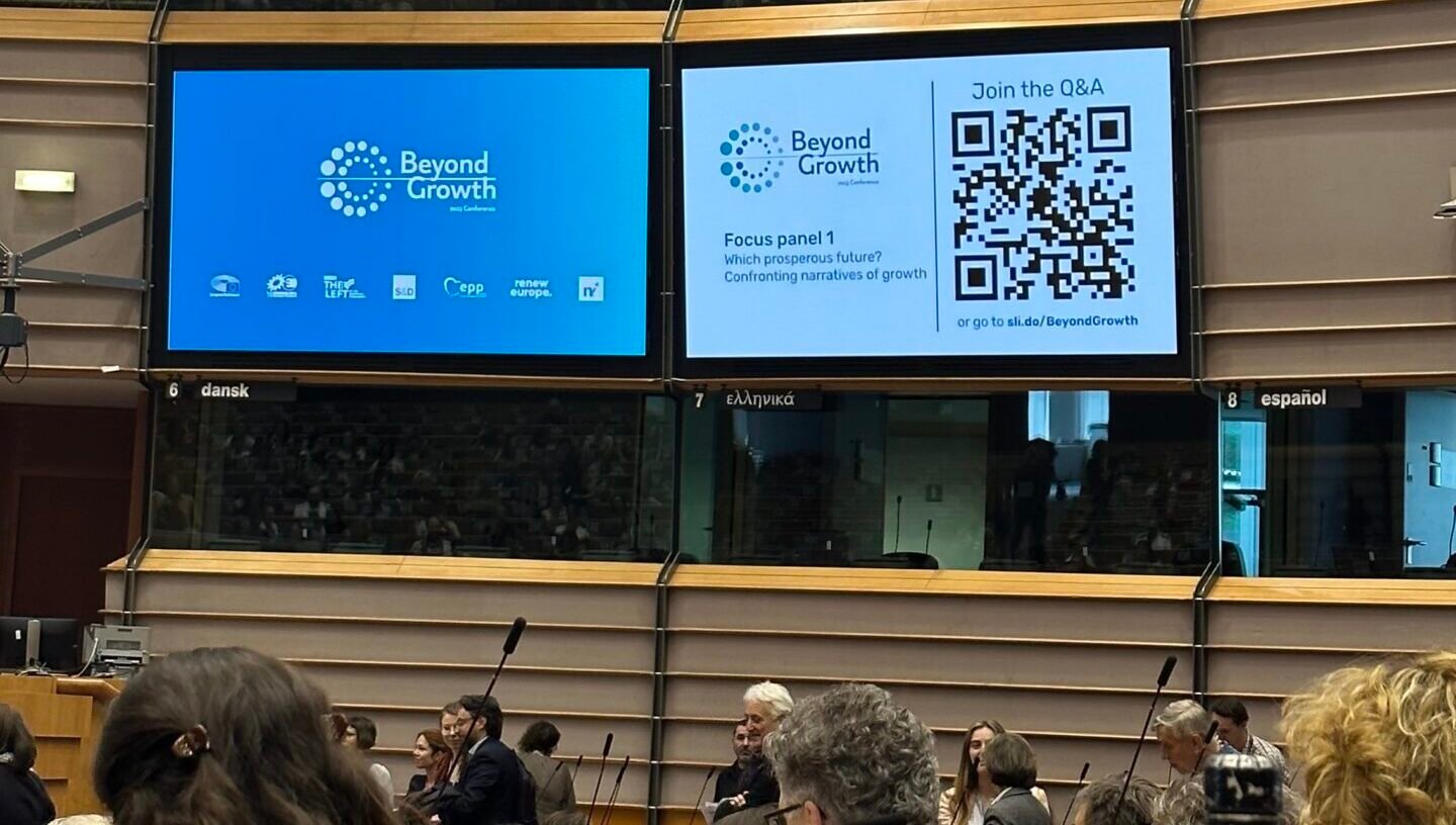
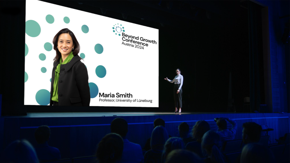
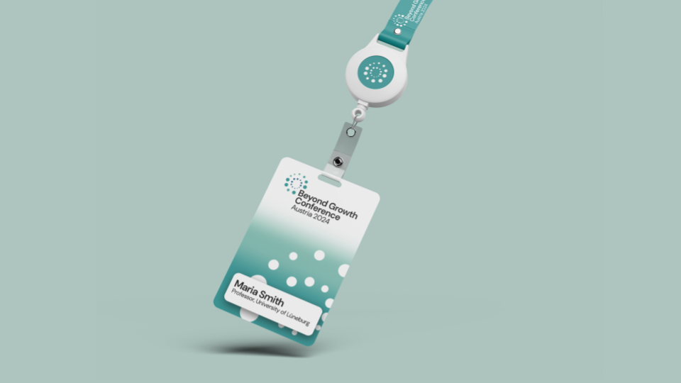
From there, we rolled out a full suite of event assets based on this visual identity, like website graphics, presentation slides, backdrops, podiums, rollup banners, lanyards, directions signs, programmes, motion graphics, social media posts and more.
The result?
An enthusiastic and diverse audience of thousands gathered in the forum of European democracy, and online, to bear witness to the considerable progress made by the scientific world and civil society over the last decade in moving beyond the economic models inherited from the 20th century, which are still at the heart of European policymaking.
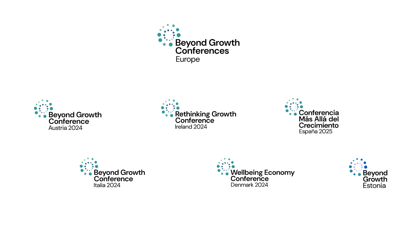
The energy in Brussels was electric—but the movement couldn’t stop there. As the idea spread to Austria, Italy, Denmark, Ireland, Spain, Estonia, and beyond, the need for a flexible, scalable visual identity became clear.
Enter: The Beyond Growth Logo Family
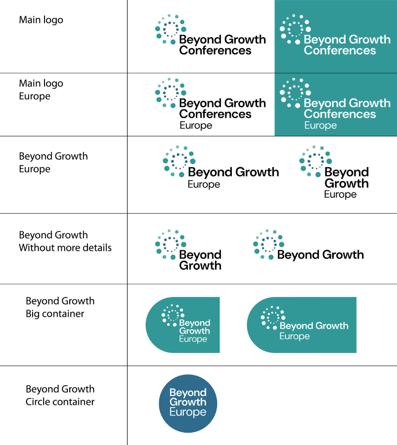
We took the DNA of the original brand—icon, typography, colour palette—and reassembled it strategically to create localised versions. Each new logo kept the essence of the mother brand while standing strong on its own.
Our strategy?
Our strategy was to keep common elements of the mother logo and change the rest to achieve an independent character and yet benefit from the brand’s notoriety, including the huge buzz around the 2023 EU-wide event.
So we looked at all the elements of the brand identity separately (the name, the icon, the typography, the colour palette, the date, the location and the format) and we strategically reassembled them to create a localisation plan that works for all.
Why it worked?
Structure + Flexibility: NGOs across Europe could adapt the identity to their needs, without losing the movement’s power.
Cost-Creative Pricing: We designed a pricing plan that supported the original organisers and future events, sharing costs in a way that made sense for everyone.
The happy ending (or just the beginning?)
The impact? Hundreds of thousands of citizens engaged. Policies questioned. Conversations ignited. And a visual identity that didn’t just represent the movement—it fueled it.
Moral of the story? When your brand needs to grow beyond borders (or growth itself), you don’t just need a logo. You need a visual revolution.
Does your brand need a magic touch?
Press below
Cookie Monster?
This website uses cookies to improve your experience. We'll assume you're ok with this, but you can opt-out if you wish. Cookie settingsACCEPT
Privacy & Cookies Policy
Privacy Overview
This website uses cookies to improve your experience while you navigate through the website. Out of these cookies, the cookies that are categorized as necessary are stored on your browser as they are essential for the working of basic functionalities of the website. We also use third-party cookies that help us analyze and understand how you use this website. These cookies will be stored in your browser only with your consent. You also have the option to opt-out of these cookies. But opting out of some of these cookies may have an effect on your browsing experience.
Necessary cookies are absolutely essential for the website to function properly. This category only includes cookies that ensures basic functionalities and security features of the website. These cookies do not store any personal information.
Any cookies that may not be particularly necessary for the website to function and is used specifically to collect user personal data via analytics, ads, other embedded contents are termed as non-necessary cookies. It is mandatory to procure user consent prior to running these cookies on your website.


 Okay When