

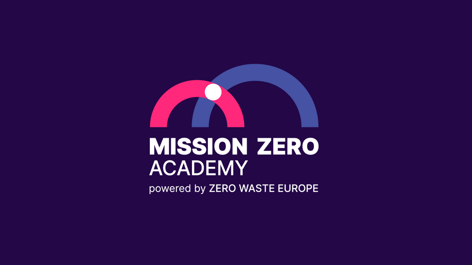
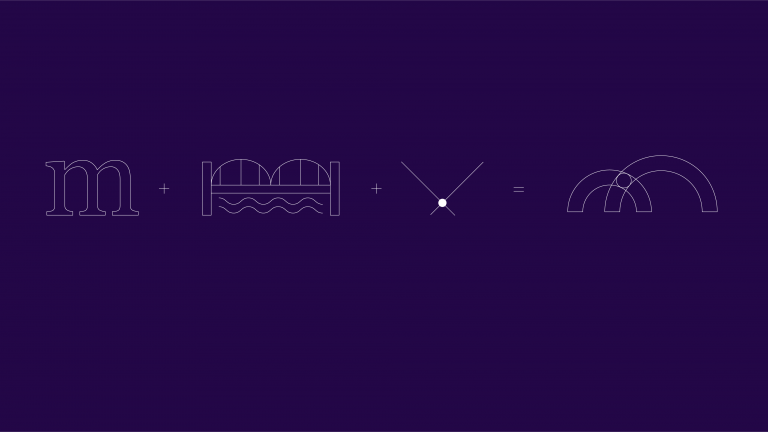
The concept we based the Visual Identity of MiZA on, is reflected in the logo. The logo combines three layers of symbolism.
The basis includes a hint of the first letter of the brand name “m”. The second layer adds “a bridge” in order to show the strong foundation, the supportive nature and the transfer of knowledge that characterise MiZA. The final layer, “the connecting dot” represents the exchange of information and the constructive interactions between multiple players throughout the journey to reach a zero waste mentality.
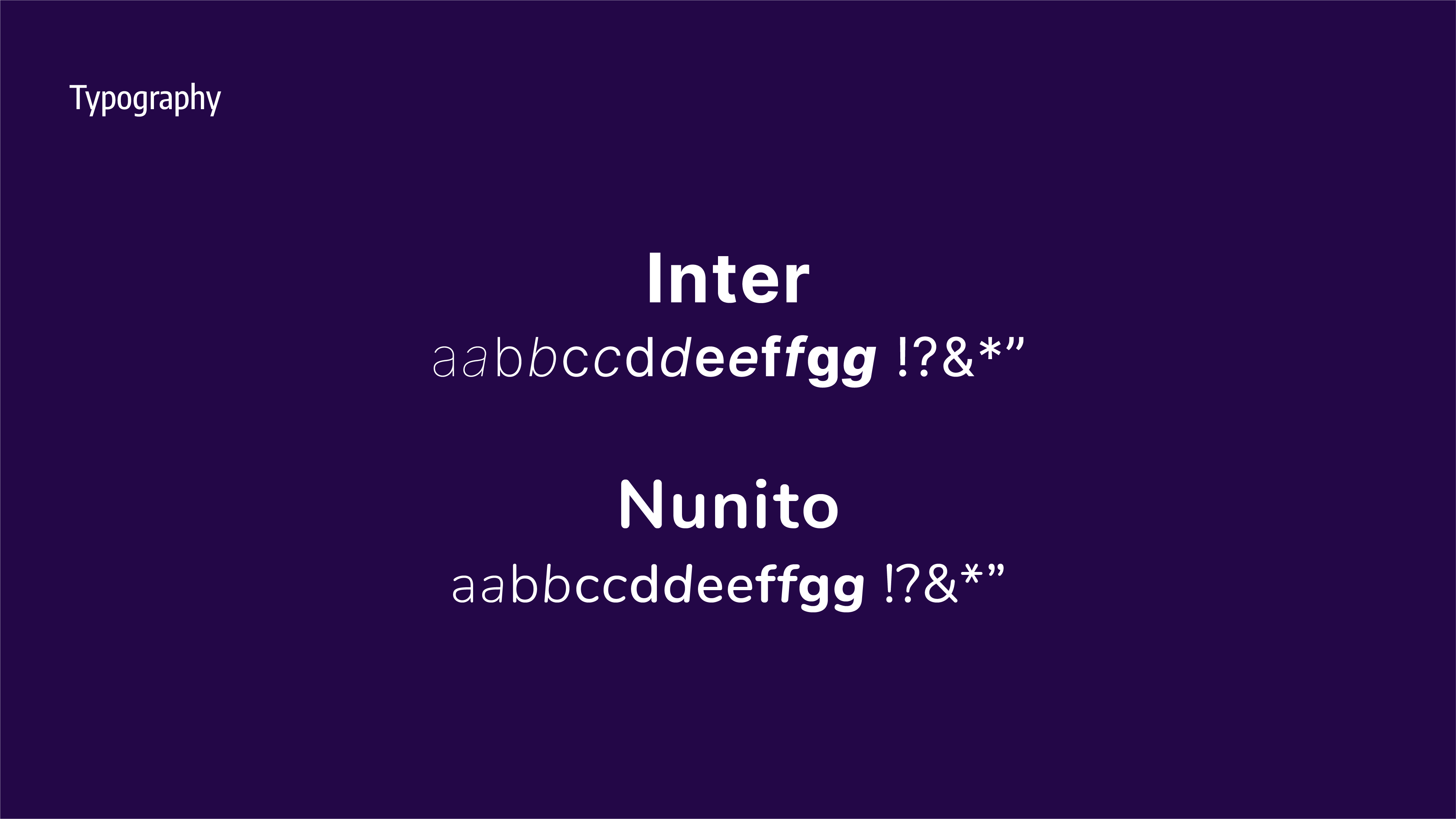
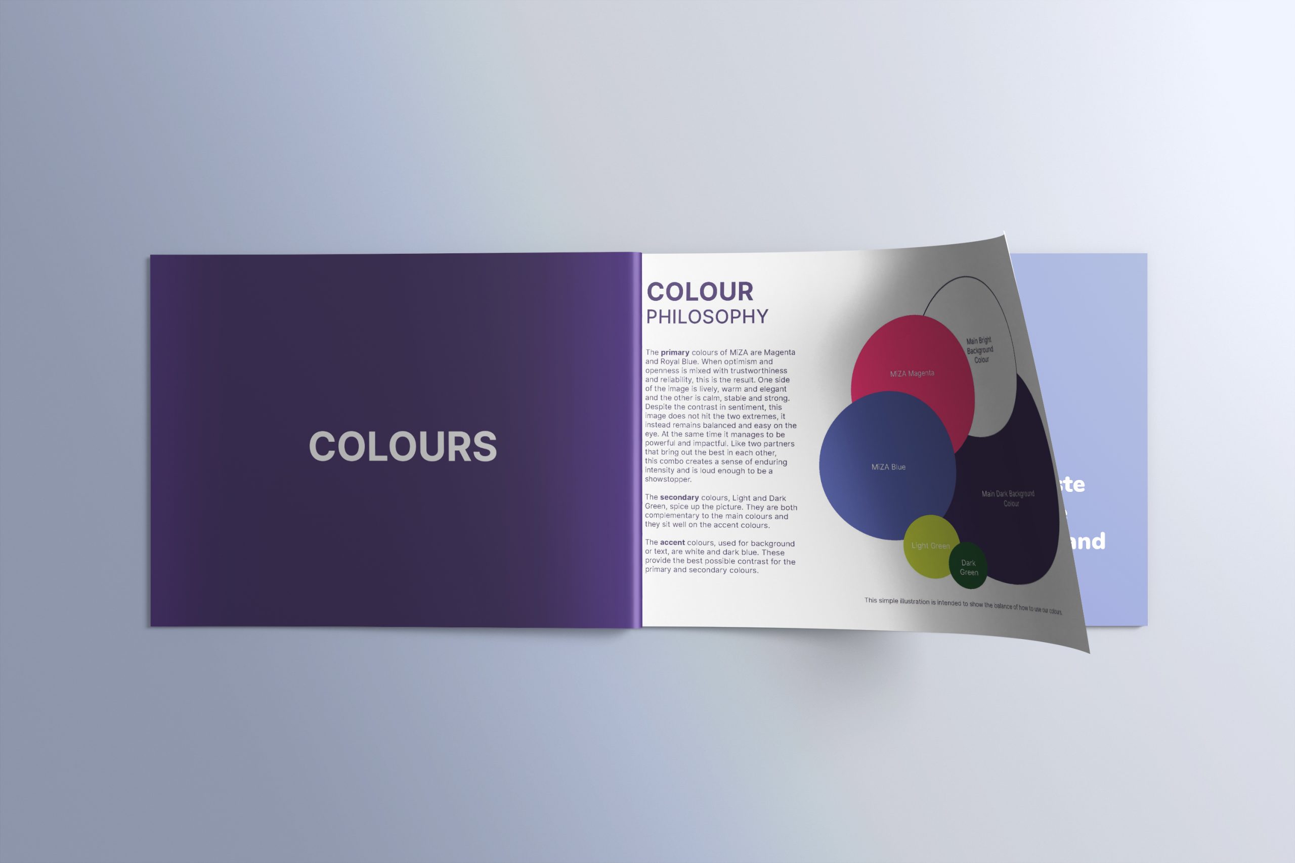
The colour palette also adds to the sense of ambition, inclusivity, honesty, and credibility that characterise MiZA. The primary colours of the logo are Magenta and Royal Blue. When optimism and openness are mixed with trustworthiness and reliability, this is the result. One side of the image is lively, warm and elegant; and the other is calm, stable and strong. Despite the contrast in sentiment, this image does not hit the two extremes, it instead remains balanced and easy on the eye. At the same time, it manages to be powerful and impactful. Like two partners that bring out the best in each other, this combo creates a sense of enduring intensity and is loud enough to be a showstopper.


 Okay When